Flikshop
Flikshop opens a conversations around the stigmatized topic of incarceration, and provides real support to those who are often overlooked.
I am redesigning the Flikshop app and website to make connections between incarcerated people, their families, and their community more seamless.
When I found out I could work on this project, I jumped at the opportunity. The Flikshop story is genuinely inspiring. The founder, Marcus Bullock, was sentenced to eight years in prison at just 15 years old. During that dark time, his mother sent him photos and letters to remind him that people on the outside loved him and were waiting for him.
After his release, Marcus created Flikshop to support his community. Flikshop has become a cornerstone for reentry support, bridging gaps between families and their incarcerated loved ones.
The problem
Despite widespread publicity and support from backers like John Legend, the Flikshop has experienced a low adoption rate among its target users. To understand why, I conducted research to learn whether to find more users or make sure the current users know about everything the app offers.
The outcome
I redesigned Flikshop app with a seamless user flow that allows exploration of all Flikshop services while creating a cohesive design system.
Role
UX Researcher
UX designer
Team manager
Methodology
Agile
Product
App & website
Time
2024 - 2025
Team
6 members
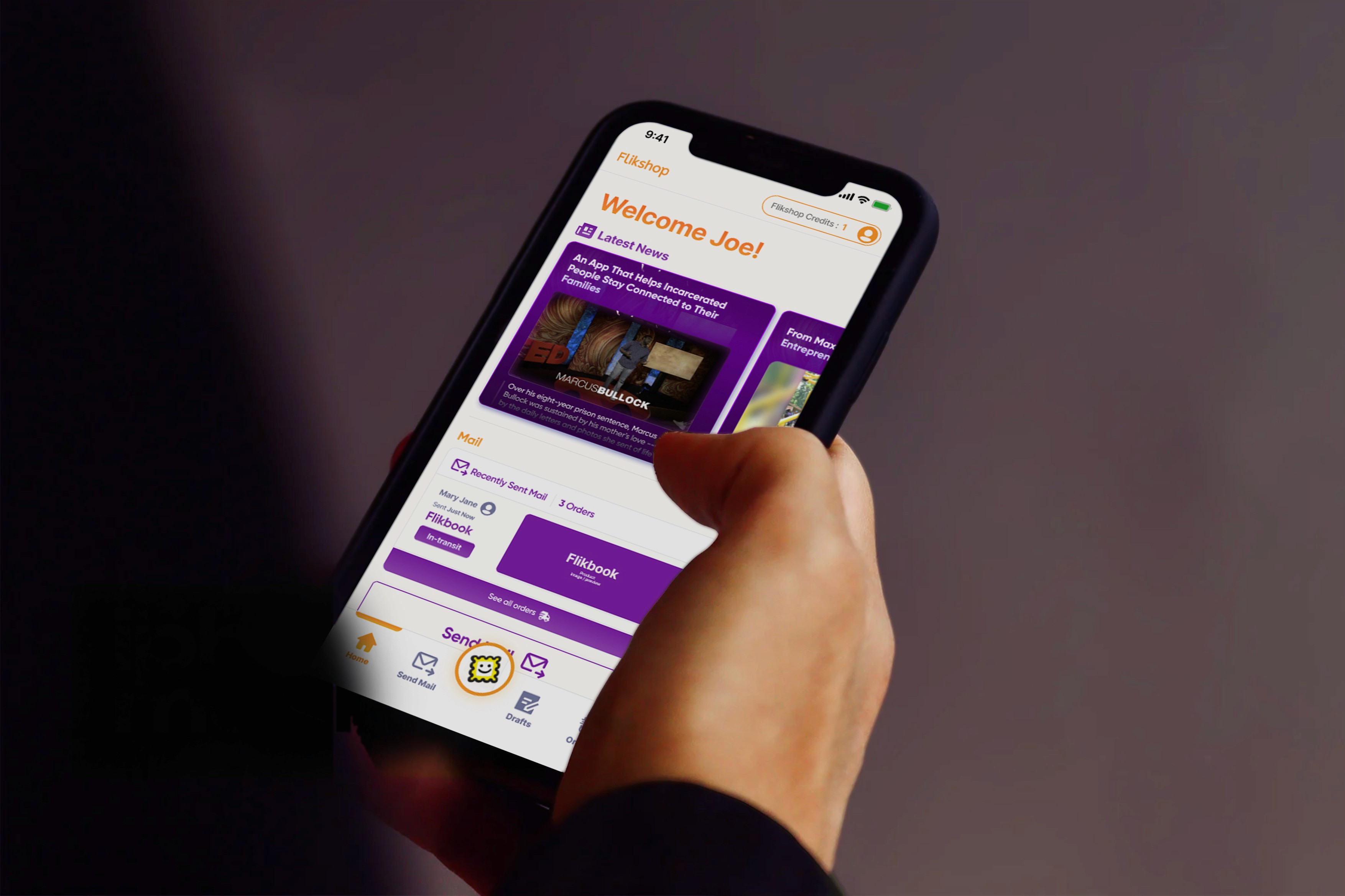
What is Flikshop?
Flikshop started as an app helping people connect with incarcerated loved ones by sending personalized postcards with photos and messages directly from their phones.
It has since expanded into three main services:

Postcard delivery
Flikshop allows people to send photos, postcards, and albums to incarcerated family members and loved ones.

School of business
Former incarcerated people can sign up for business classes that helps them gain skills to launch startup, build enterprises, or advance your career.

Neighborhood
Businesses that want to support reentry for formerly incarcerated people can find information and connect with them through Flikshop Neighborhood.
Flikshop Impact
Source: Forbes.com

Marcus' TedTalk has over 1.8 million views on Ted.com
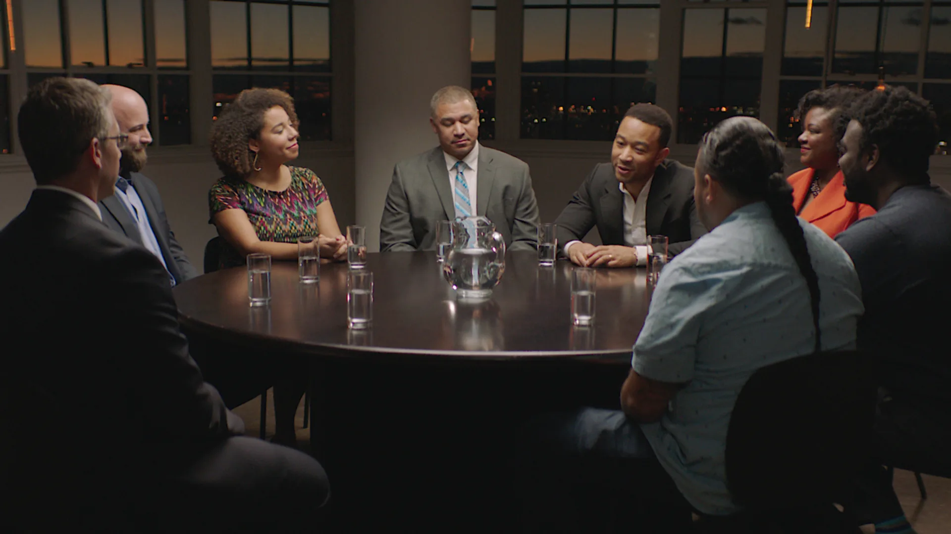
John Legend leads a roundtable with Marcus and other entrepreneur, FastCompany
“…it’s the only way for you to know that someone loves you on the other side of that fence.”
Marcus Bullock on getting mail in prison
My Role
As the UX designer in this project,
During the design phase, I sketched potential solutions and created both low- and high-fidelity prototypes.
I built and maintained a design system for consistent UI across platforms, aligning with scalability needs.
For research, I crafted survey and interview questions, and analyzed the data from research.
I facilitated meetings with all stakeholders to define a project scope that balanced the client’s needs and our timeline, ensuring change management adoption.
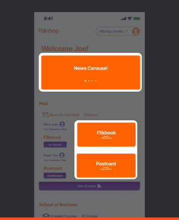
Final Designs
Onboarding tutorial
One of the main solutions we incorporated was introducing an overview of Flikshop's services in the beginning of user journey,
Once users create an account, each service is introduced on a dedicated page, guiding them to the features they want to explore.
Angels donation and reward program
The Angels feature encourages users to actively support incarcerated individuals and their families through small, recurring donations.
The Rewards section encourages ongoing giving by unlocking perks as users donate, adding a light incentive to sustained support.
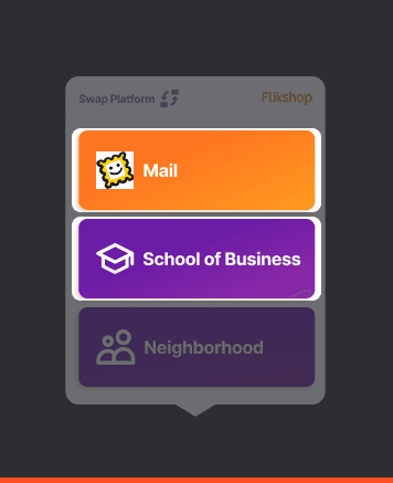
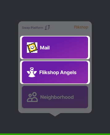
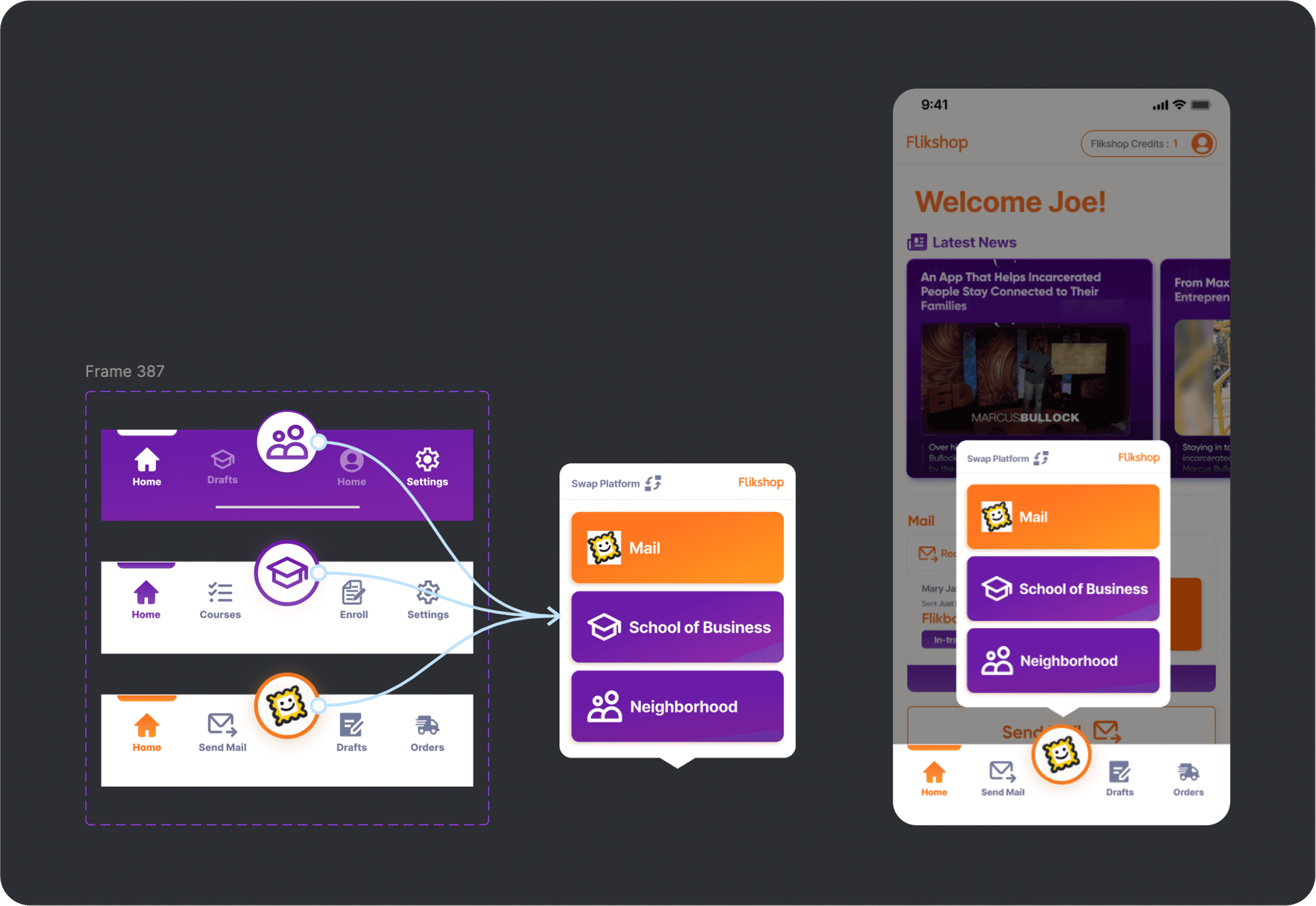
Services are accessible through the main app button
In Home Page, we designed a single app button that allows access to all three services, and an introductory tutorial directs users to the information and services they need.
Project Schedule
Starting Sprint 1
The client came to us with a question:
I want more people to use the app
To figure out where to focus, we first needed to identify the biggest growth opportunity—either by attracting new users or improving engagement with existing ones. Since we had limited access to Flikshop users for direct interviews, we took a bottom-up approach, starting with data analysis to determine whether expanding the user group would be a viable growth strategy.
Sprint 1 :
Should we expand the user group, or focus on the current one?
Research
Methodologies
To decide whether Flikshop should expand its target audience, we used these research methods:
Competitive Analysis (8 competitors)
Flikshop’s landscape relative to competitors to identify growth opportunities.
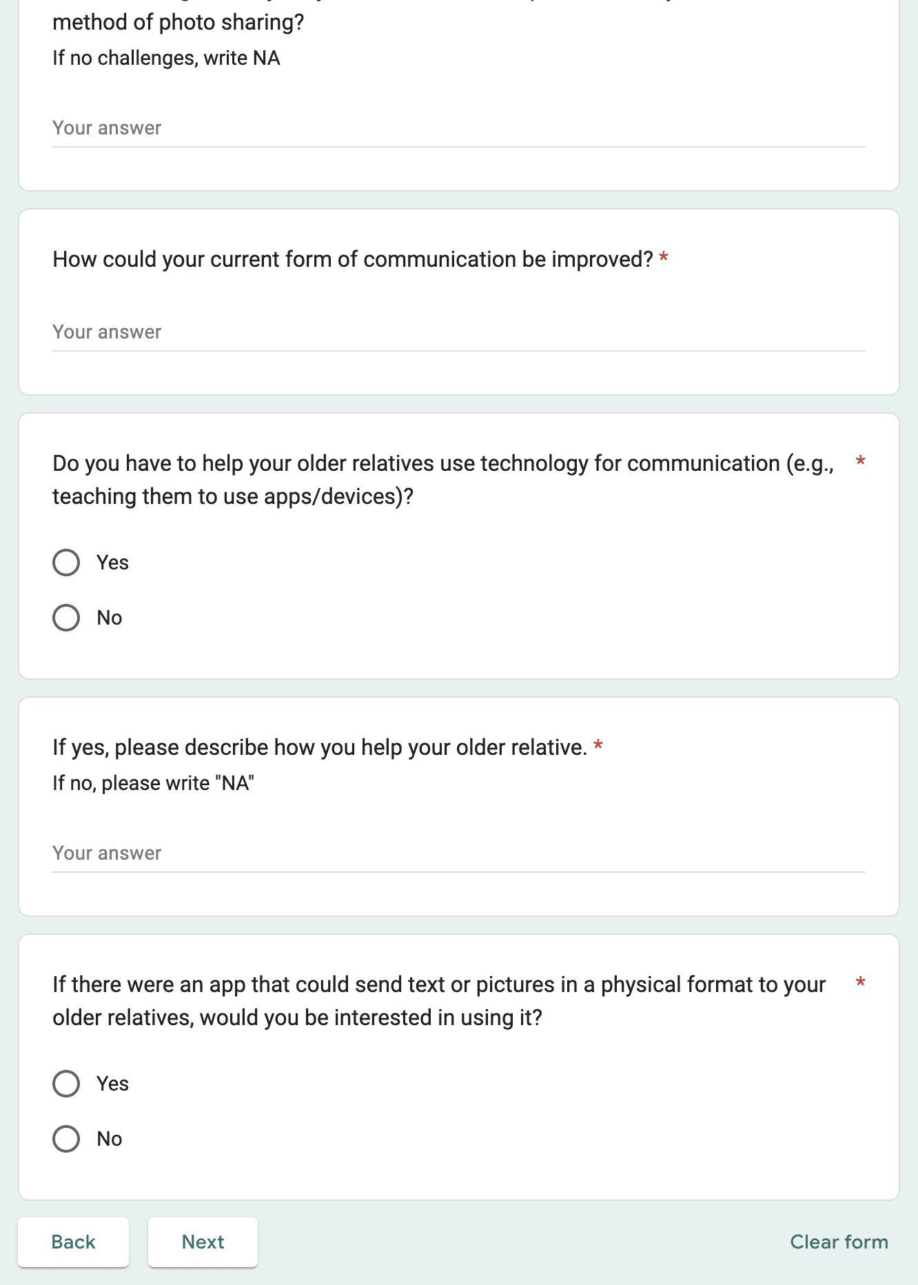
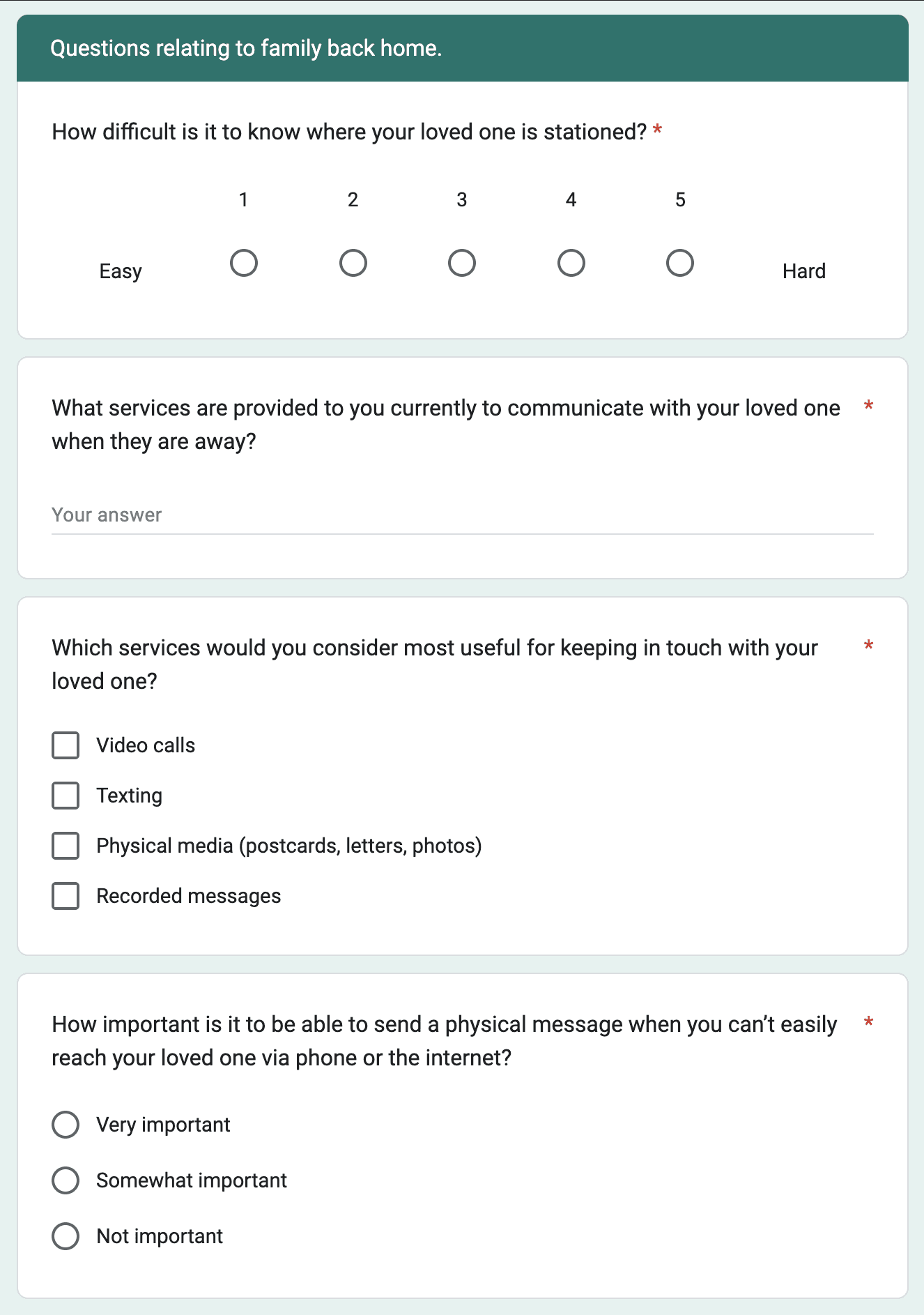
Surveys (28 respondents)
Evaluate two potential user groups (Military families and Elderly people)for expansion.
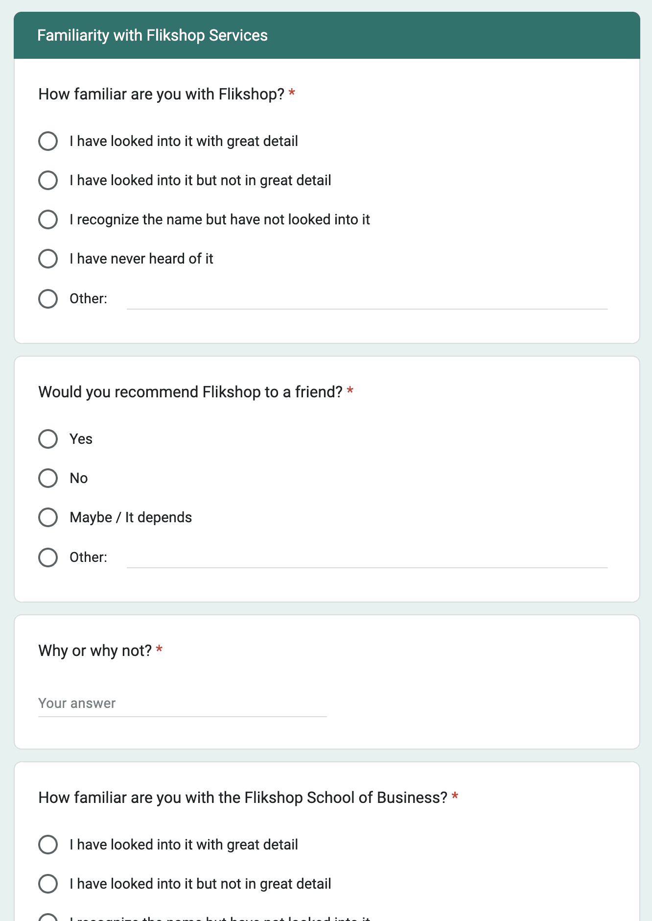
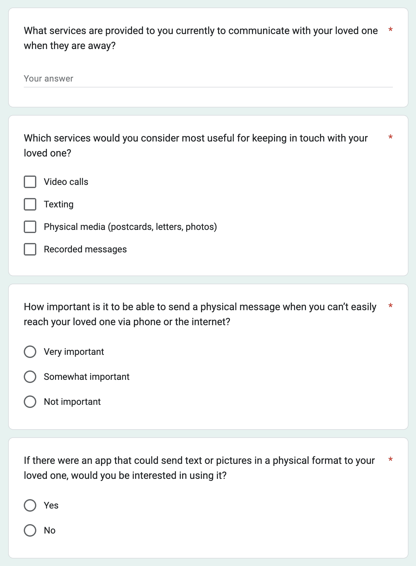


Surveys questions, competitive analysis and results
Key Findings
& Next steps
After analyzing the research results, I found that there isn’t currently a market for Flikshop among military families and elderly people, as they have more access to digital platforms than expected. Additionally, the competitive analysis highlighted what sets Flikshop apart from its competitors and revealed where its potential lies. Based on these findings, we were confident about our next steps:
Focus on the current user group, making sure their core needs are fully addressed.
Shift marketing toward brand storytelling, highlighting the client’s unique story, customer testimonials, and the idea of “connecting loved ones”.
Modernize UX and UI to create an iconic, recognizable design.
Enhance onboarding, accessibility, and visual design for a more inclusive, user-friendly experience.
Starting Sprint 2:
Based on our research, the next step was to improve user engagement with the app. After analyzing the company’s user engagement metrics, we found that users weren’t interacting with the other services pages. To address this, we brainstormed multiple solutions and ultimately chose the most effective one:
Sprint 2 :
How can we introduce each service in the application?
Ideation
With all our findings in hand, we started the ideation phase, and every team member contributed.
1. Brainstorming

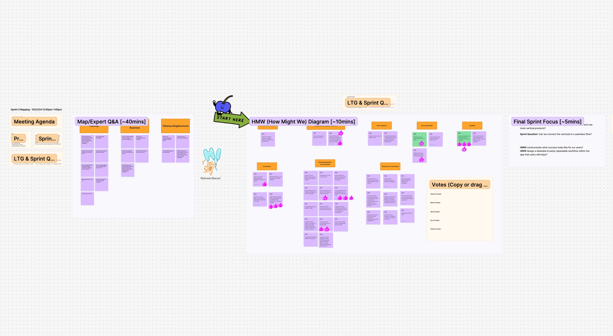
During a mapping session, we identified the company’s challenges and brainstormed “how might we” questions. Together with the client, we then voted on the top priorities to guide Flikshop’s focus.
2. Setting the Focus

Once the priorities were clear, we knew exactly what to tackle.
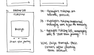
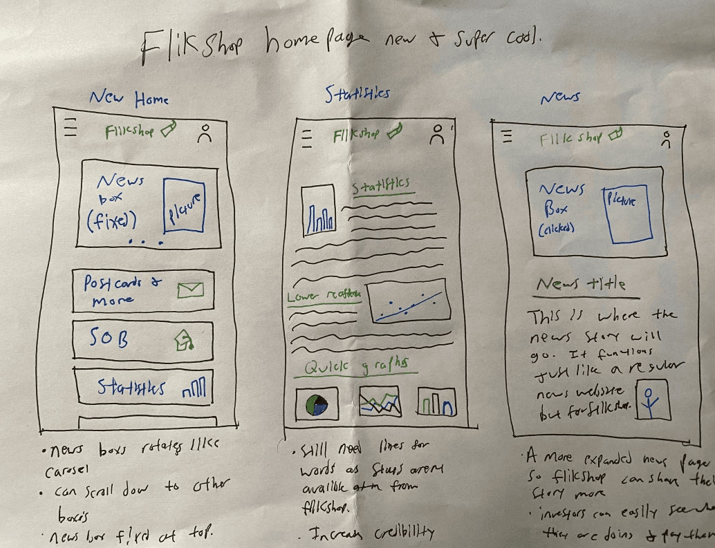
4. Sketching


I sketched multiple ideas and explored my favorites ones by using the Crazy 8 method.
4. Prioritizing


We presented each idea to the client and held a final vote to choose the best solution.
Final decision
Best sketched solutions
Here are the key ideas we chose. Each offer new ways to improve the app experience.

Usability Testing
& Iterations
After meeting with the client, and showing the first MVP of the prototype, the client asked us to make some changes on the prototype before moving on to the next step.
Before
I initially used both orange and purple throughout the interface. However, the client clarified that orange should be reserved for key moments.
After
In response, I replaced most orange elements with purple, keeping orange only for critical data and primary calls to action.
Before
The client decided to shift focus away from the School of Business feature, replacing it with Flikshop Angels to better align with updated strategic priorities.
After
In response, the service and it's logo was change. along with the color from orange to purple.
Design System
Since this project spans three platforms, app, desktop, and mobile web, I built the design system alongside the process to make sure all interfaces look consistent.

Designing the navigation bar
I designed three distinct navigation bars using the app’s main color palette to maintain cohesion while differentiating them visually. Since the current app primarily uses orange for Flikshop Postcard, I kept it unchanged and used purple for the two new services.
User Testing
Goals
After designing our minimum viable product I conducted user testing to gather data about how users feel about the following:
Overall Aesthetic – Ensuring a clean, engaging look.
Instant Transition – Making switching between platforms feel seamless.
Guided Onboarding – Improving clarity and ease of use.
User Interests at Sign-Up – Tailoring the experience based on whether users want to send mail, explore the
Neighborhood Datahub, or join the School of Business.
Results
We conducted a small usability test with 3 individuals including the client. We was looking to test clarity, completion and comprehension of the different features. Here are their feedbacks:
• Users enjoyed the guided tutorials explaining the functions
• Text and button size should be bigger for easier reading
• Reduce clutter on the home screen
“I really like the idea of getting a user acquainted with the app at first as well as using the intuitive platform switcher!”
Pilot Study Participant
Measuring the outcome
After recently handing off the project to Flikshop developers, the company hasn't yet published the new design. However based on the business objectives and UX goals


Retrospective
We first explored expanding the user group, but a better approach would have been to assess whether the app fully meets current users' needs. This would have provided a stronger foundation for growth decisions.
Since we needed to design three user journeys for 3 different services, due to time constraints, we chose to test one design instead of conducting A/B testing.
Explain technical terms to your client to avoid confusion and unnecessary emails.
End each discussion by repeating the conclusion or next steps to stay aligned with your client.
This project has been delivered and is currently in the implementation phase.The key KPIs I would track post-launch include:
- Service Exploration Rate – to measure user engagement with features beyond postcard sending
- App Share Rate – to assess emotional connection and likelihood to recommend
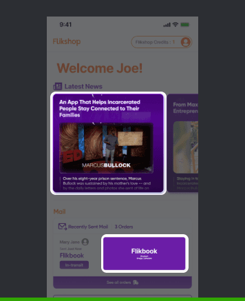
- Clicks on News Box – to evaluate engagement with impact stories and trust-building content