Flikshop App Redesign
Flikshop opens a conversation around the stigmatized topic of incarceration, and provides real support to those who are often overlooked. I redesigned the Flikshop app and website to make connections between incarcerated people, their families, and their community more seamless.
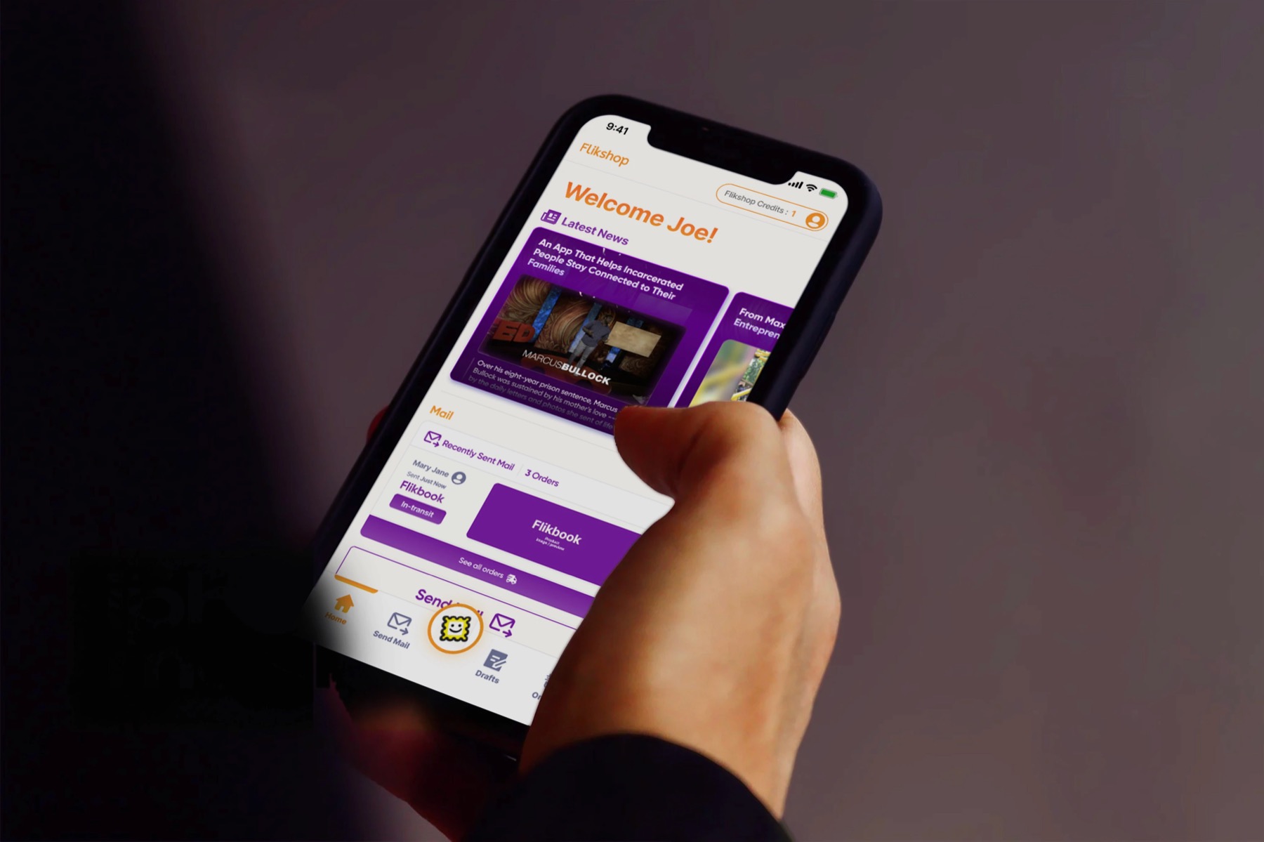
When I found out I could work on this project, I jumped at the opportunity. The Flikshop story is genuinely inspiring. The founder, Marcus Bullock, was sentenced to eight years in prison at just 15 years old. During that dark time, his mother sent him photos and letters to remind him that people on the outside loved him and were waiting for him.
After his release, Marcus created Flikshop to support his community. Flikshop has become a cornerstone for reentry support, bridging gaps between families and their incarcerated loved ones.
The problem
Despite widespread publicity and support from backers like John Legend, Flikshop experienced a low adoption rate among its target users. I conducted research to learn whether we should find more users, or make sure current users know about everything the app offers.
The outcome
I redesigned the Flikshop app with a seamless user flow that allows exploration of all Flikshop services, while creating a cohesive design system.
What is Flikshop?
Flikshop started as an app helping people connect with incarcerated loved ones by sending personalized postcards with photos and messages directly from their phones. It has since expanded into three main services:
Send photos, postcards, and albums to incarcerated family members and loved ones.
Formerly incarcerated people can sign up for business classes to gain skills to launch a startup or advance their career.
Businesses that want to support reentry can find information and connect with formerly incarcerated people.
Source: Forbes.com · Marcus' TedTalk has over 1.8M views on Ted.com
“It's the only way for you to know that someone loves you on the other side of that fence.”— Marcus Bullock, on getting mail in prison
My role
- Sketched potential solutions and created both low- and high-fidelity prototypes.
- Built and maintained a design system for consistent UI across platforms, aligning with scalability needs.
- Crafted survey and interview questions, and analyzed the resulting research data.
- Facilitated meetings with all stakeholders to define a project scope that balanced client needs and timeline.
Final designs
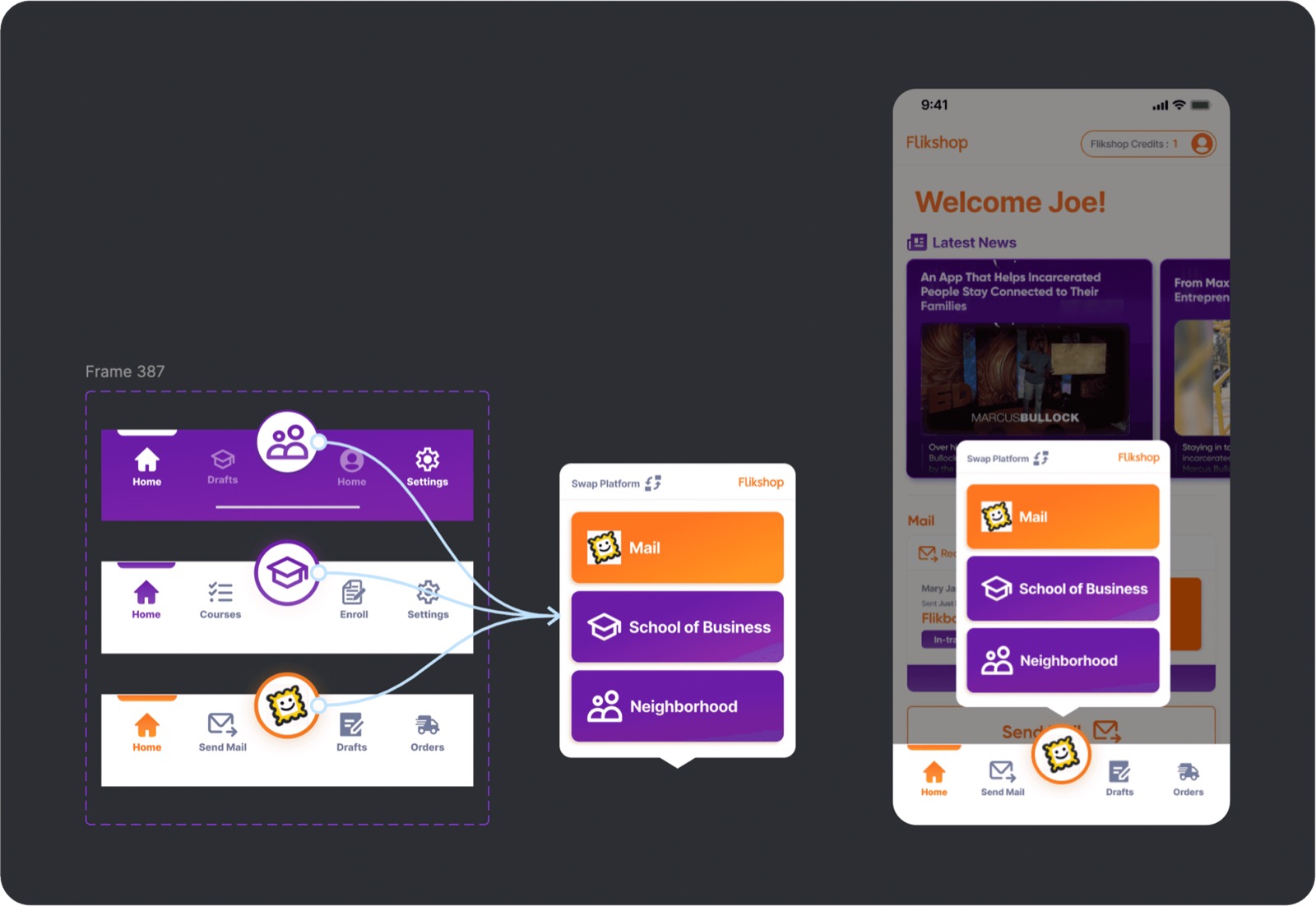
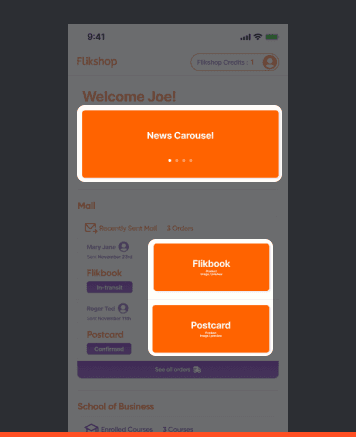
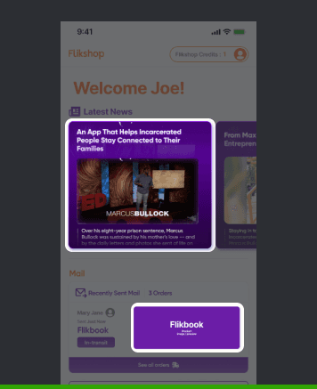
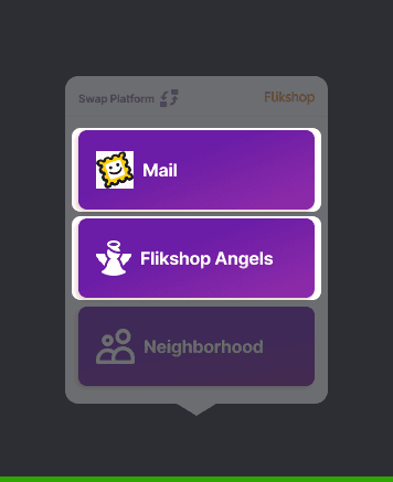
An onboarding tutorial introduces Flikshop's services at the start of the user journey — each service gets a dedicated page guiding users to the features they want to explore. All three services are reachable through a single main app button, switchable at any time.

Research methodology
To decide whether Flikshop should expand its target audience, I ran a competitive analysis of 8 competitors and surveyed 28 respondents across two potential user groups — military families and elderly people — to evaluate expansion opportunities.
Key findings & next steps
There isn't currently a market for Flikshop among military families and elderly people, since they have more access to digital platforms than expected. The competitive analysis highlighted what sets Flikshop apart and where its potential lies. Based on these findings:
- Focus on the current user group, making sure their core needs are fully addressed.
- Shift marketing toward brand storytelling — the founder's story, customer testimonials, and "connecting loved ones."
- Modernize UX and UI to create an iconic, recognizable design.
- Enhance onboarding, accessibility, and visual design for a more inclusive experience.
Ideation
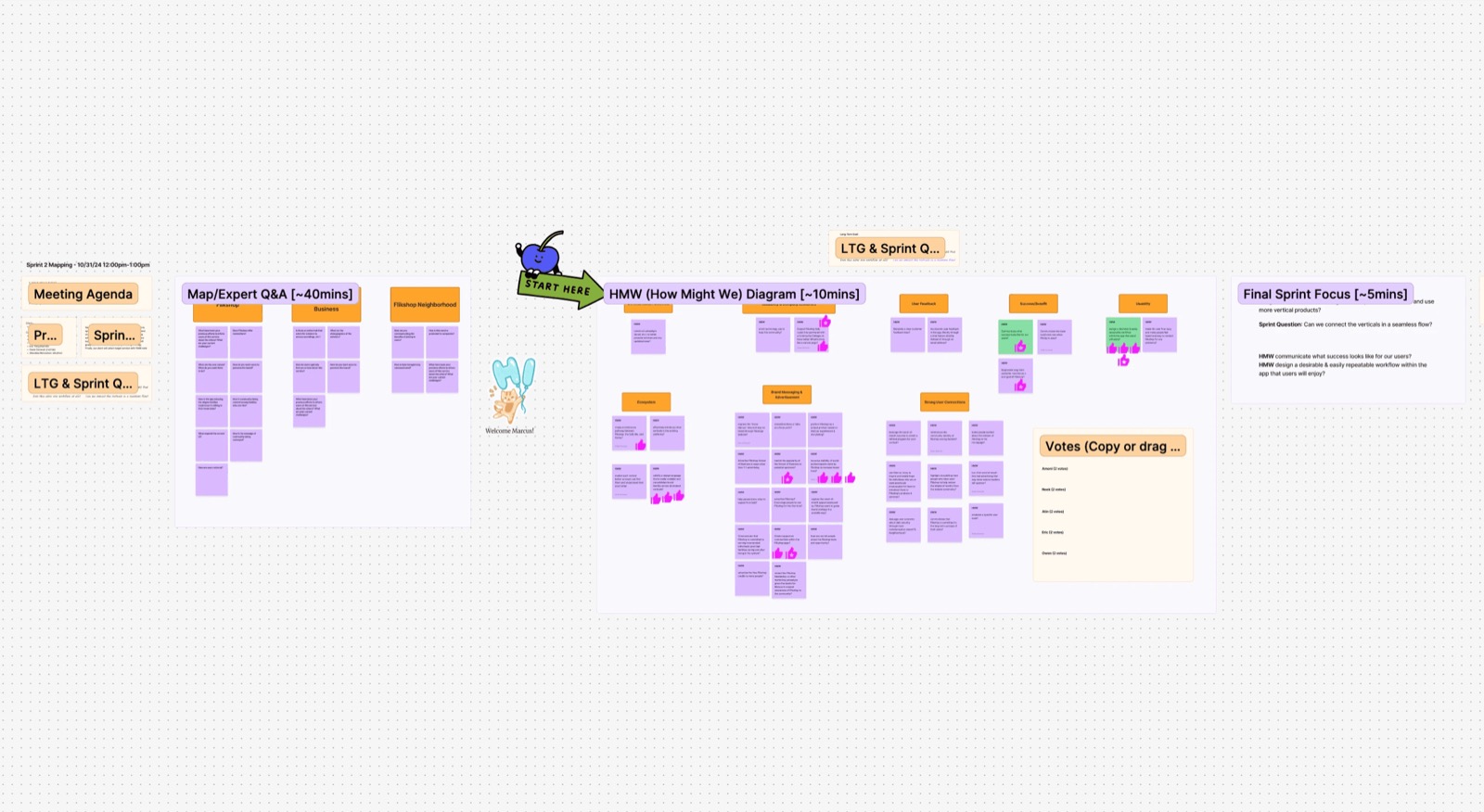
With findings in hand, the whole team contributed to a brainstorming and "How Might We" mapping session to identify challenges and vote on top priorities.
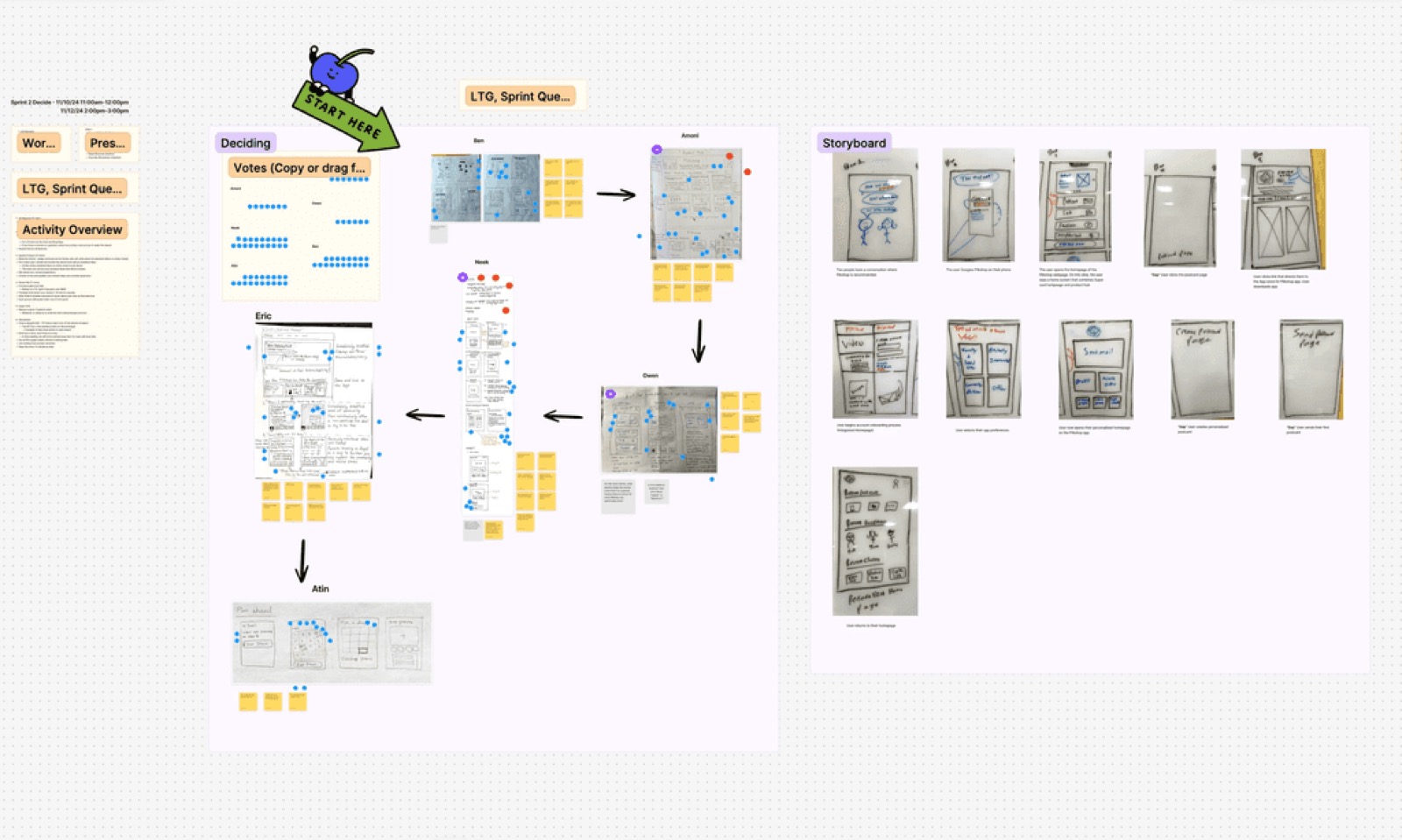
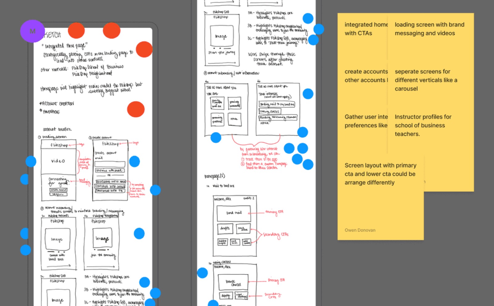
I sketched multiple ideas and explored favorites using the Crazy 8s method, then presented each to the client for a final vote on the best solution.
Usability testing & iterations
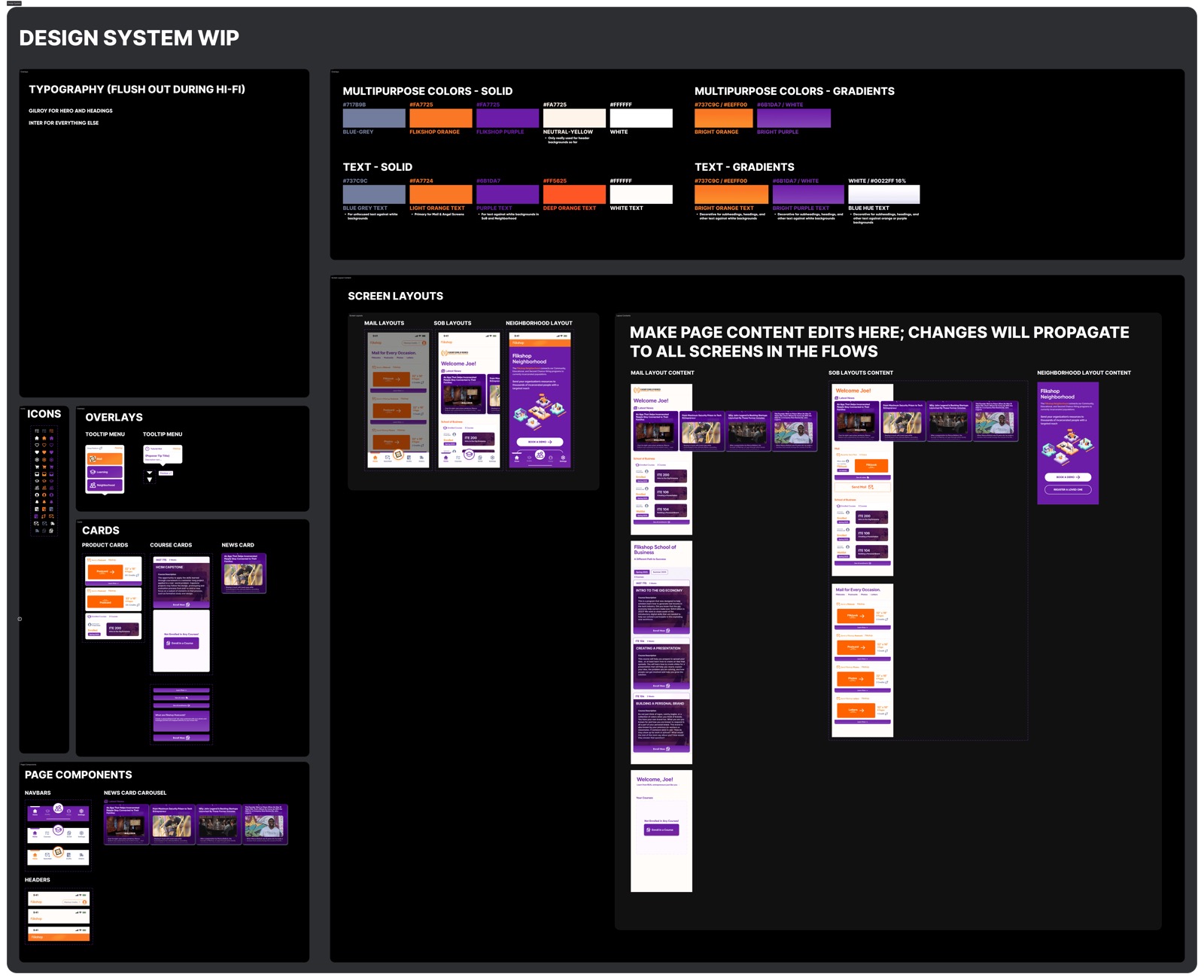
After sharing the first MVP prototype, the client asked for changes. Two examples: orange and purple were initially used throughout the interface, but the client clarified orange should be reserved for key moments — so I replaced most orange elements with purple, keeping orange only for critical data and primary calls to action. Separately, the client shifted focus away from School of Business in favor of Flikshop Angels, so that service and its color/logo changed to match.
Design system
Since this project spans app, desktop, and mobile web, I built the design system alongside the process to keep every interface consistent — including three distinct navigation bars sharing the app's core palette while staying visually differentiated by service.
User testing
After the MVP, I ran a small usability test with 3 individuals (including the client) to check clarity, completion, and comprehension across the redesign.
- Users enjoyed the guided tutorials explaining each feature.
- Text and button size should be bigger for easier reading.
- Reduce clutter on the home screen.
“I really like the idea of getting a user acquainted with the app at first, as well as using the intuitive platform switcher!”— Pilot study participant
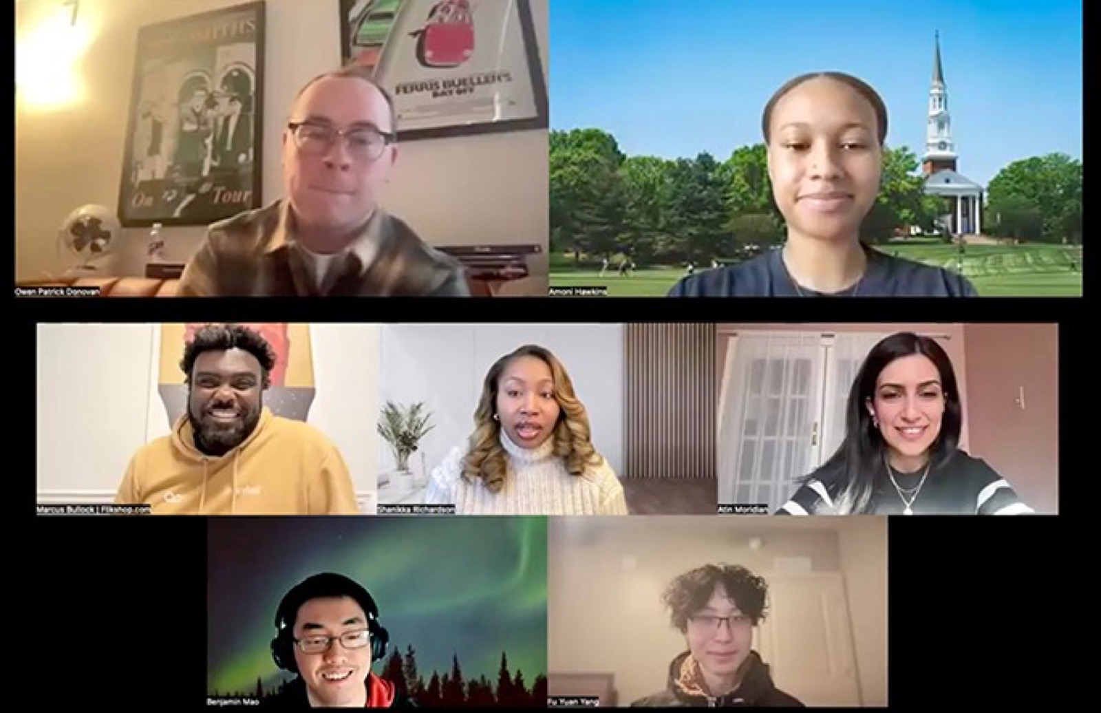
Weekly team meetings with the client, Marcus Bullock, and the Flikshop team.
Retrospective
I initially explored expanding the user group, but assessing whether the app fully meets current users' needs first would have been a stronger foundation for growth decisions. Time constraints also meant testing one design per service rather than running true A/B tests.
Measuring the outcome
This project has been delivered and is currently in the implementation phase. Post-launch, I'd track: service exploration rate, app share rate, and clicks on the news box for engagement with impact stories.