Venturist
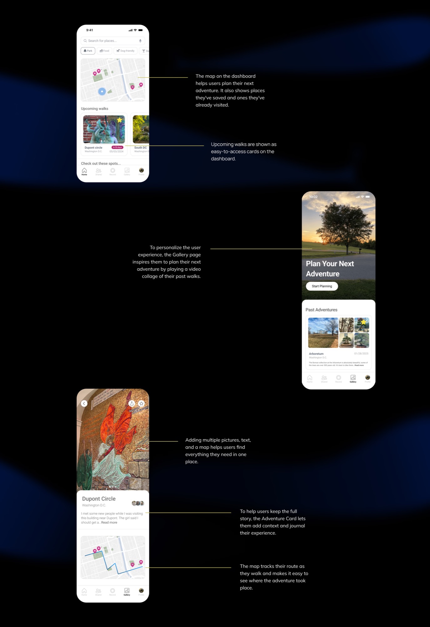
People can't share a full journey with friends because current platforms separate photos, locations, and stories instead of combining them into one experience. Venturist is an app for urban explorers that combines an interactive memory map with journaling tools.
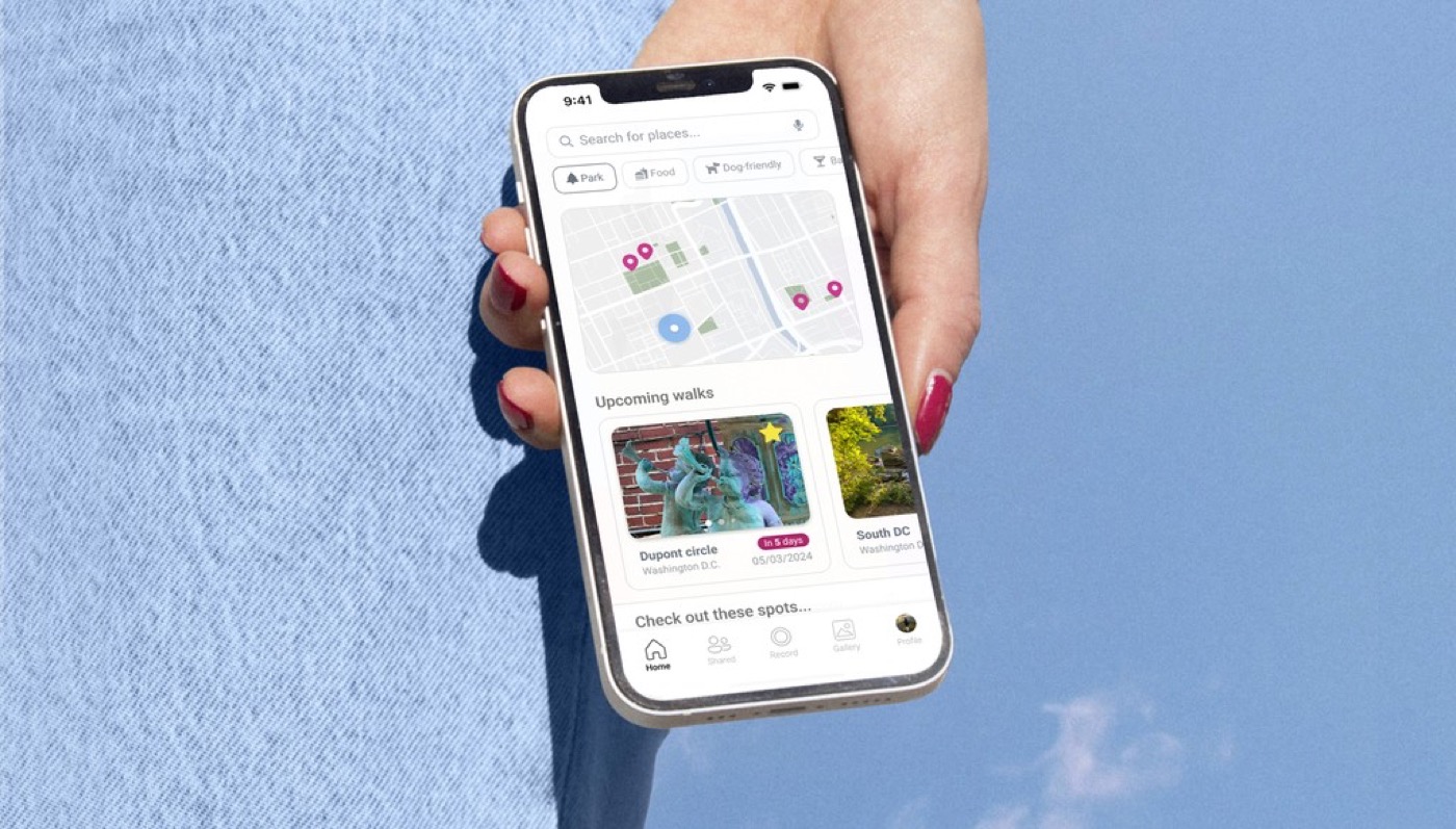
One of my favorite hobbies is going on long walks — sometimes I find hidden coffee shops or secret graffiti. But there was no way to keep all those experiences together: the photos, stories, and locations. Venturist solves that, helping users document and share experiences, discover unique places, and plan their next adventure.
Problem
How can people document different details about an adventure and easily share them with their friends?
Outcome
A mobile app that lets users create and organize photo collections with notes, linked to specific routes and locations.
Final Screens — each service is introduced in a different screen
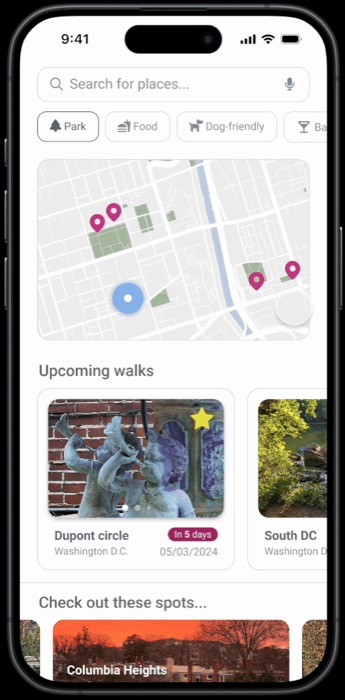
Each service is introduced in a different screen
One of the main solutions was introducing an overview of the app's services at the start of the user journey, guiding people to the features they want to explore.
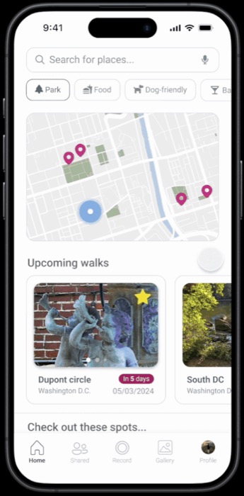
Services accessible through the main app button
On the Home Page, a single app button gives access to all services, with an introductory tutorial directing users to the information and features they need.
Guerrilla research with 10 participants
I interviewed 10 people to understand how they suggest places to others — the tools and media they use, the context of the recommendation (spontaneous vs. planned), and how they organize or explain the information.
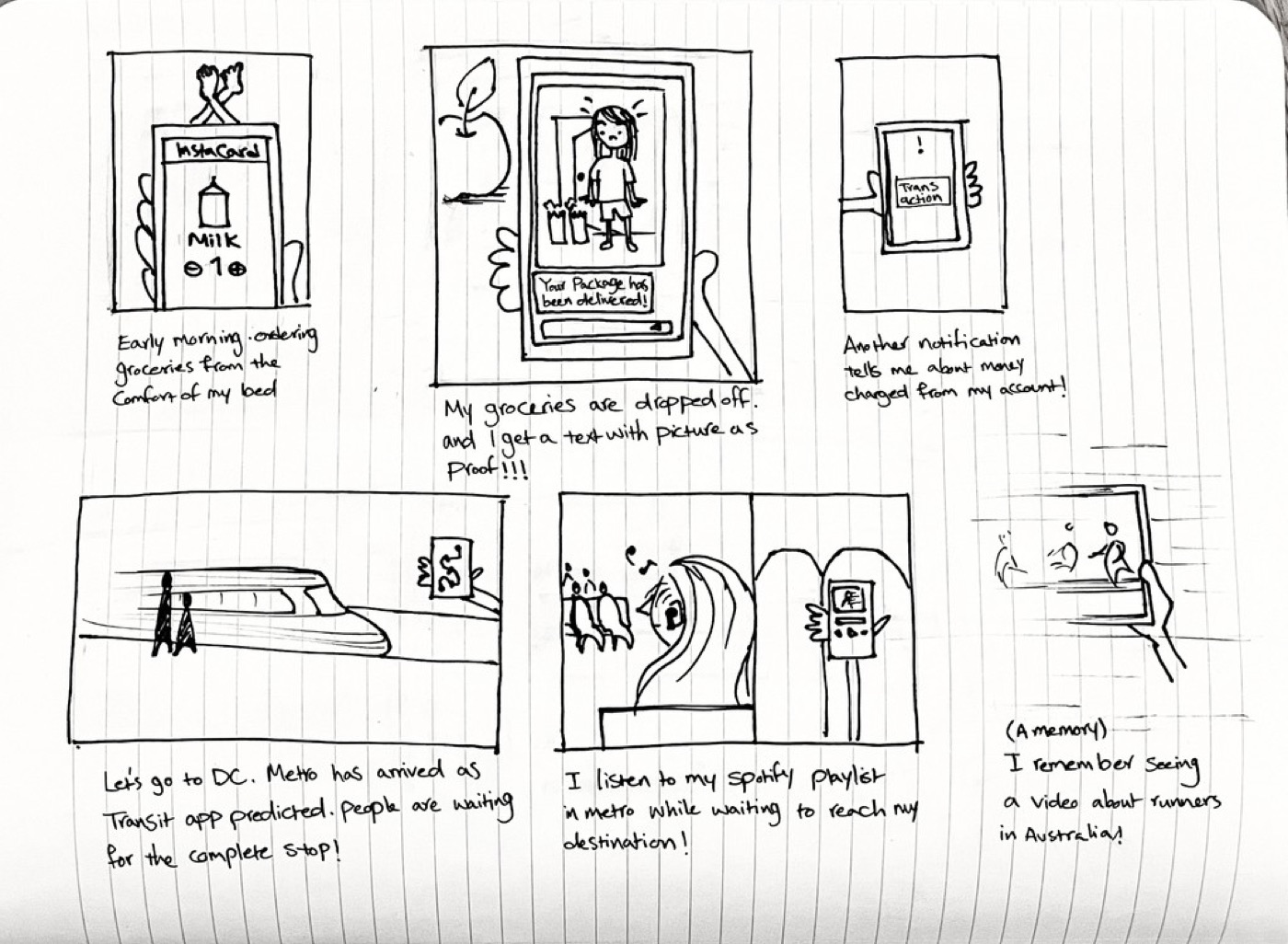
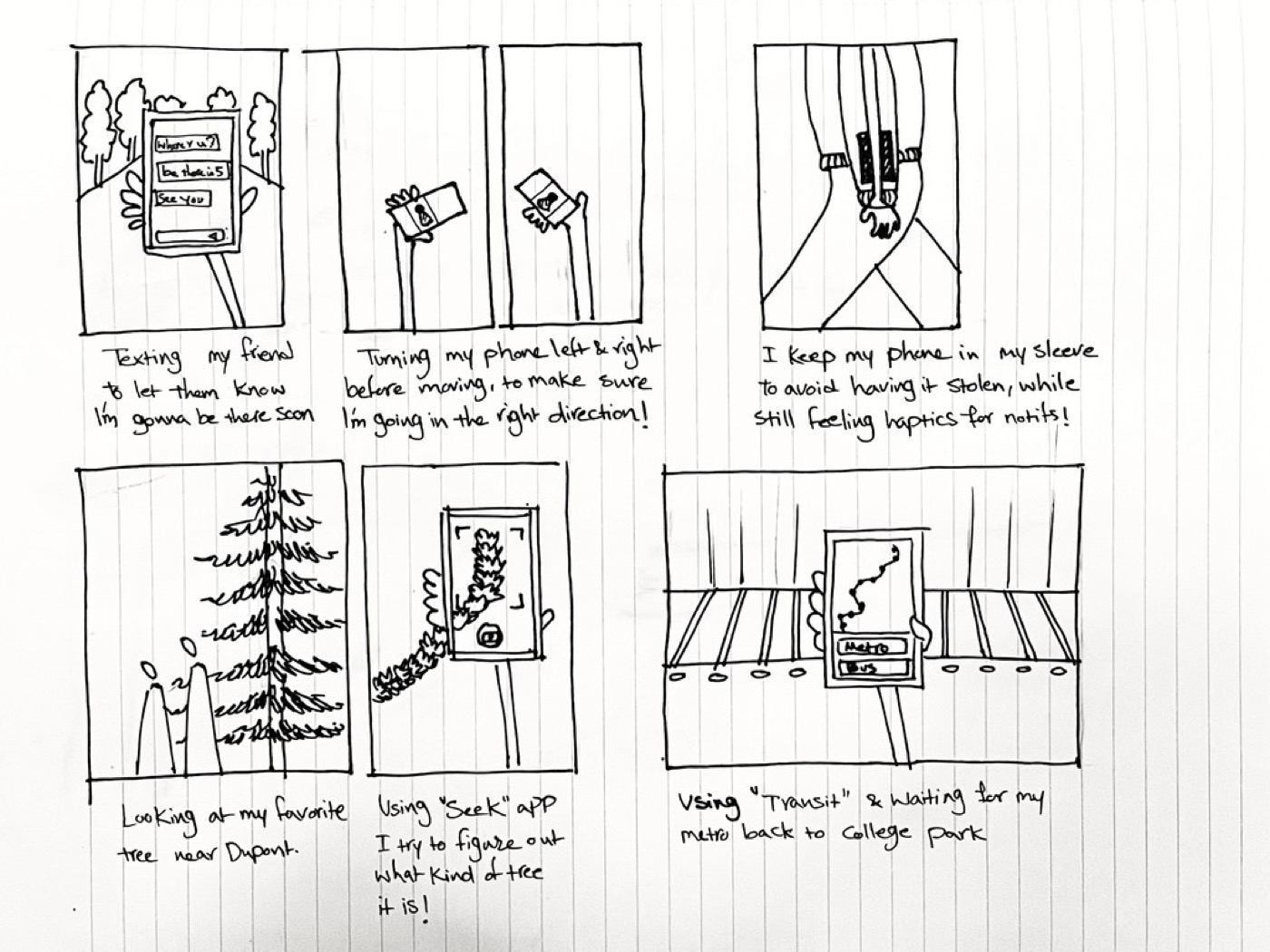
Self-observation
Another fun exercise was documenting how I interact with my own phone throughout the day. It helped me understand that information should be concise and scannable, galleries should be easily editable, colors need high contrast for visibility, and buttons should be large and tappable to reduce effort.
Synthesizing interview insights and secondary research, I identified the core issues people are facing: too many apps — switching between maps, messages, and photos just to share a journey; no clear way to organize or show the order of places; and it's easy to forget to explain why each place mattered.
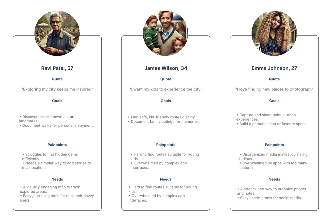
User personas
This is where ChatGPT was extremely helpful. I started by using prompts to analyze competitors, which helped the system better understand my target users. Then I used it to create different user scenarios and stories — surfacing ways people might use the app that I hadn't considered on my own.
Design opportunities
Through the research process, these stood out as the most significant design opportunities:
- A detailed planning feature that lets users mark spots and calculate a route.
- A collection of past and future adventures that's easily accessible and editable.
- A simple flow for sharing walks with friends.
Information architecture
Using AI to build the information architecture was challenging — I tried various prompts, but they kept missing key features on the home pages and the connections between main pages. Eventually I designed it myself, sketching wireframes so I knew exactly what each component looked like and where to place it, to accurately represent the app's structure.

Design system
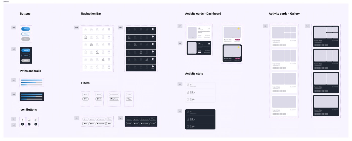
I designed the interface with basic, neutral colors on purpose — to encourage users to post more pictures and videos of their own activities. Those photos give life to each screen and create a unique identity for each person's account.
Final screens
After the discovery and design phase, I created the high-fidelity screens below.