xFoundry
xfoundry.orgI was the lead web designer at xFoundry, a nonprofit alliance founded at the University of Maryland that works with universities across the country, turning each one into a “solution engine” where students, industry leaders and investors build ventures around real-world problems.
My main focus was making a growing website easy to navigate. I shaped the site’s structure and content by working closely with students, xFoundry’s CEO, faculty leaders, industry experts and investors, and worked across information architecture, user research, UI design and content modeling.
Lead Web Designer




Merging two websites into one
Problem /
xFoundry ran two websites, one for students and one for alliance members. When I audited both, I found most of their content overlapped.
Approach /
I merged them into one site, so each audience could see how the other takes part, then rebuilt the structure so everyone still finds what they are looking for.
Before: two sites
I tagged every menu item: on both sites, or only on one. Most pages existed twice, and the rest fit naturally into a single site.
Navbar for website 1 (student-facing)
 Unique
Repeated
Repeated
Repeated
Repeated
Repeated
Unique
Unique
Unique
Unique
Unique
Unique
Repeated
Repeated
Repeated
Repeated
Repeated
Unique
Unique
Unique
Unique
Navbar for website 2 (alliance-facing)
 Repeated
Repeated
Repeated
Repeated
Unique
Unique
Unique
Repeated
Repeated
Repeated
Repeated
Repeated
Unique
Unique
Unique
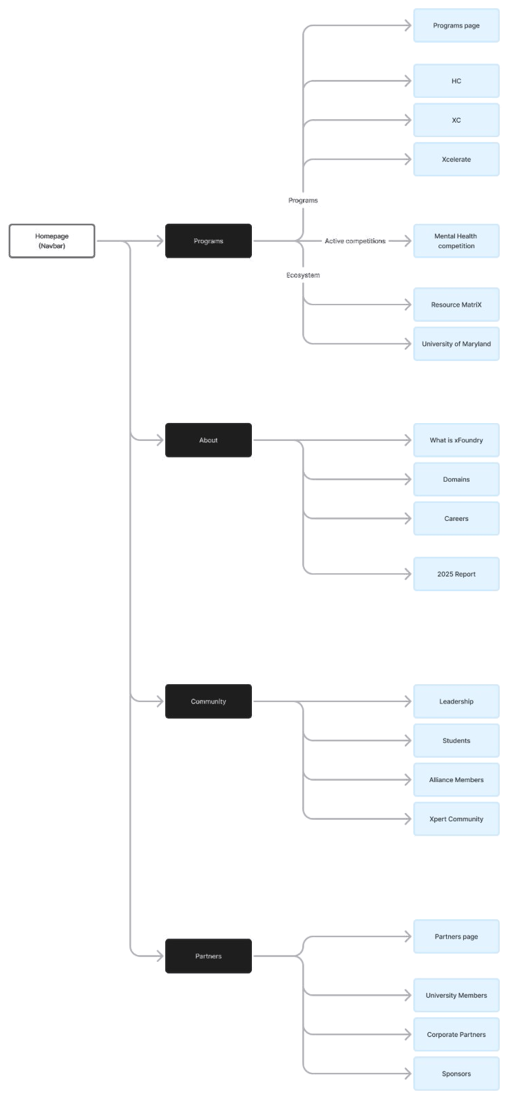
New sitemap
I combined pages that existed on both sites, sorted them by familiar website conventions so every page sits under the category it belongs to, and renamed unclear pages so they’re easy to understand and find.
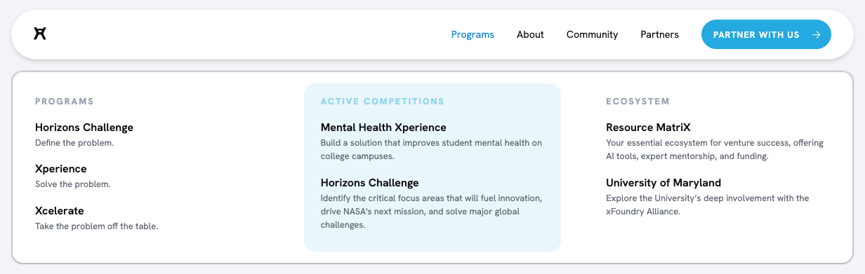
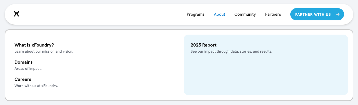
New navbar
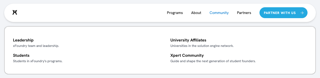
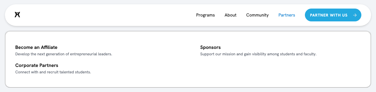
One navbar for both audiences. Students see how alliance members work with universities, members see what students get, and blue boxes highlight what’s happening now.
Ordering the page by students’ questions
Research /
I asked several students what they’d want to know before joining a competition, and wrote down their questions in order.
Approach /
I compared their answers and, from the pattern and order of their questions, built the information hierarchy for every competition page: understand, decide, explore, get help.
Since these pages shipped, the programs have grown from 108 sign-ups to 400+ as of May 2026.
What students asked, in order
Hierarchy from user interviews
Can I join?
How it shipped
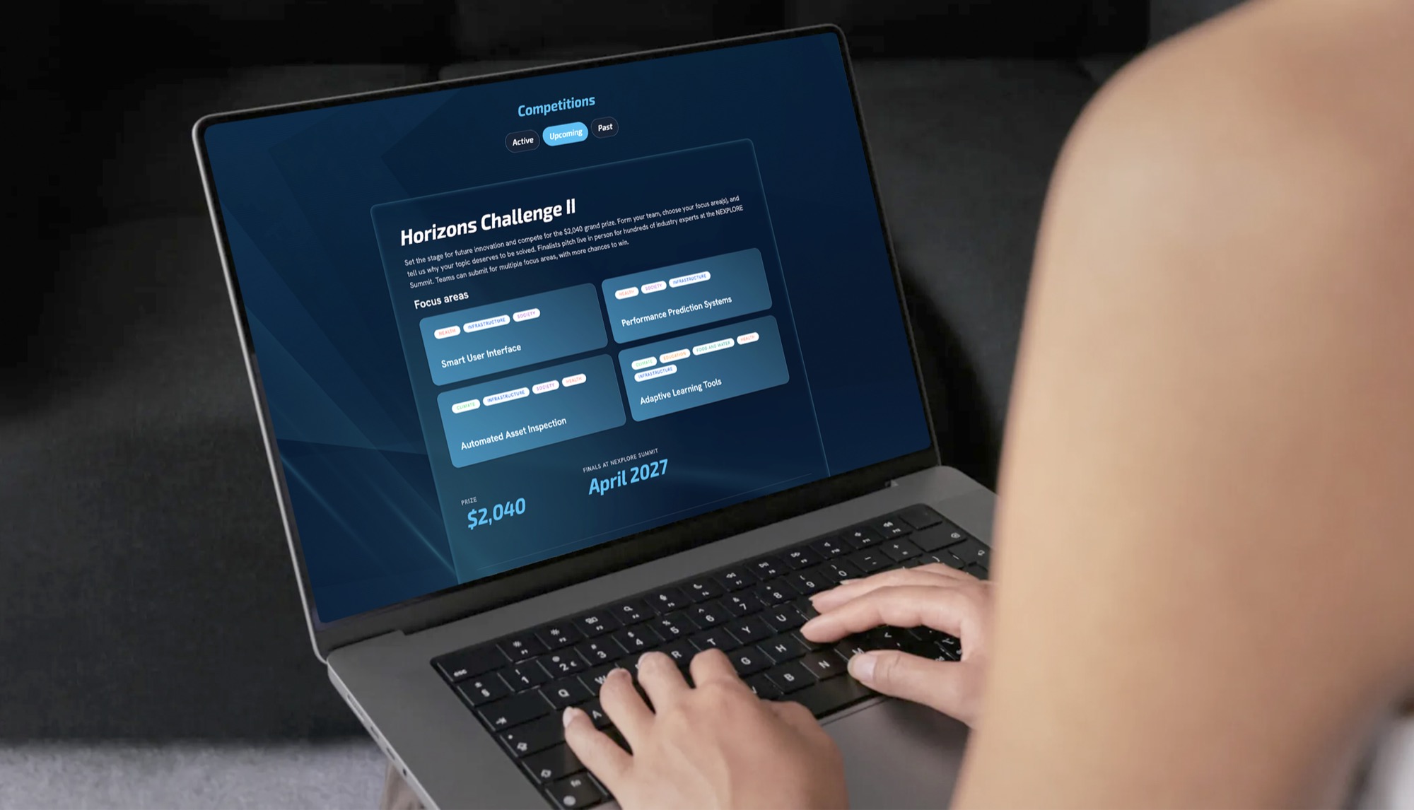
Live Horizons Challenge page

A card for every competition stage
Problem /
Competitions are always at different stages: one running, one open for registration, several finished.
Approach /
One tabbed section with a card design for each stage. Each one leads with what a student needs at that moment.
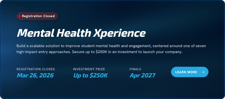
Active
For competitions that are currently underway. Registration is closed and teams are competing.
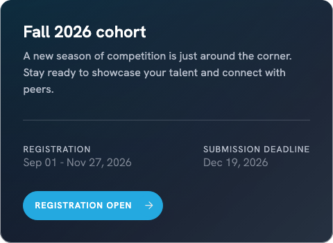
Upcoming
For competitions with registration open now, or opening in the future.
Registration opens later
Past
For competitions that have ended and been awarded. Keeping them on the page shows how competitions have changed over time.
Try it · recreated from the live Competitions section
Competitions
Mental Health Xperience
Build a scalable solution to improve student mental health and engagement, centered around one of seven high-impact entry approaches. Secure up to $250K in an investment to launch your company.
Horizons Challenge II
Set the stage for future innovation and compete for the $2,040 grand prize. Form your team, choose your focus area(s), and tell us why your topic deserves to be solved. Finalists pitch live in person for hundreds of industry experts at the NEXPLORE Summit.
Focus areas
Predictive User Interfaces
Smart interfaces that know what you need before you do.
Human Performance Monitoring
Health and safety monitoring tools that tell us when we are at risk.
Autonomous Asset Inspection
AI as a tool to warn before failure in infrastructure, systems, and parts.
Adaptive Learning
Learn, adapt, and configure in high stress environments.
Fall 2026 cohort
A new season of competition is just around the corner. Stay ready to showcase your talent and connect with peers.
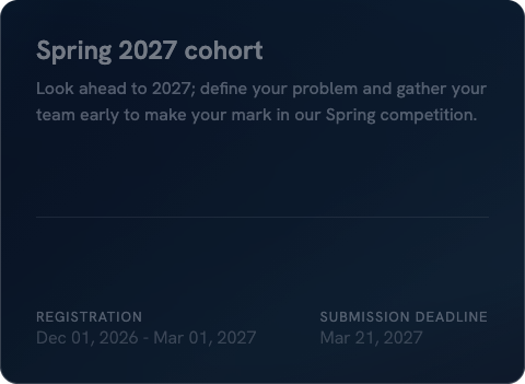
Spring 2027 cohort
Look ahead to 2027; define your problem and gather your team early to make your mark in our Spring competition.
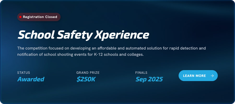
School Safety Xperience
The competition focused on developing an affordable and automated solution for rapid detection and notification of school shooting events for K-12 schools and colleges.
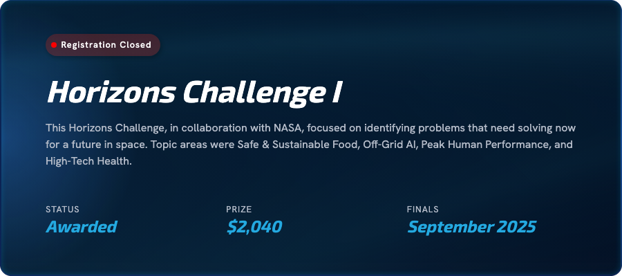
Horizons Challenge I
This Horizons Challenge, in collaboration with NASA, focused on identifying problems that need solving now for a future in space. Topic areas were Safe & Sustainable Food, Off-Grid AI, Peak Human Performance, and High-Tech Health.
Short student videos instead of testimonials
Problem /
I wanted students to hear about other students’ experiences with our programs. Written quotes felt rigid and staged, and one long video asked too much of someone scanning the page.
Approach /
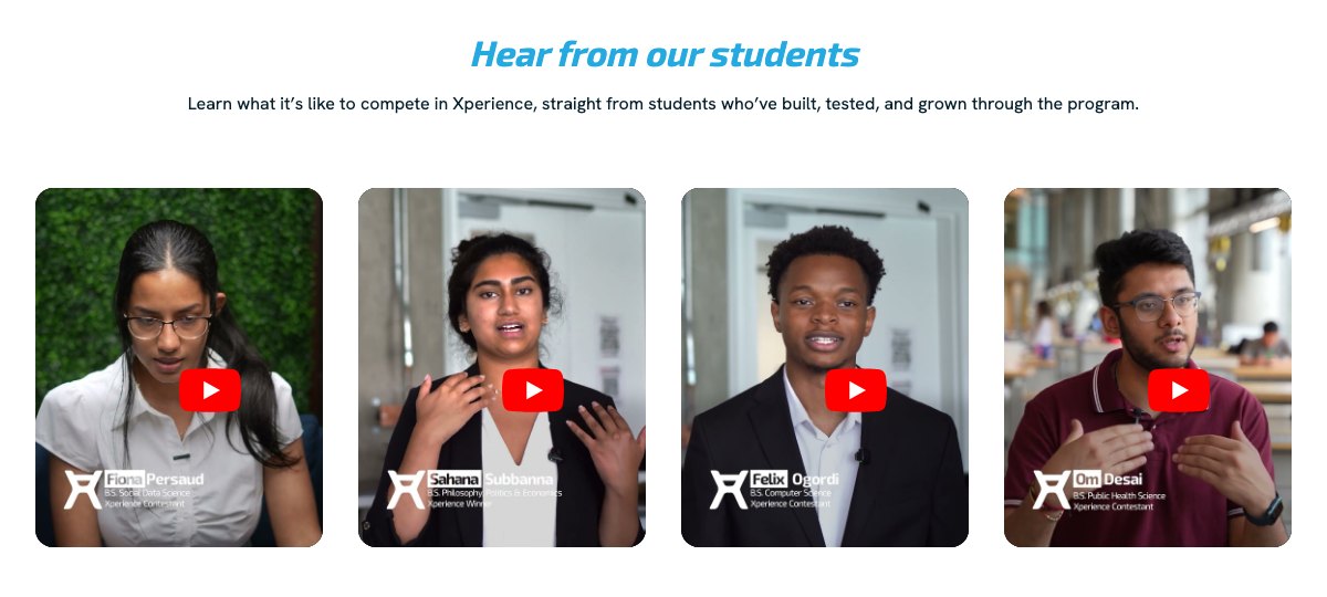
I picked short vertical clips of different students talking about the program’s impact on their educational and professional growth. It was important to show their faces and let them speak in their own words.
Written testimonials
Not chosenAdds more text to the page and is easy to skim past.
One long video
Not chosenAsks for minutes before the viewer gets a single answer.
Short vertical clips
ChosenAround 20 seconds each. Scannable, and in the vertical format students already watch.
Shipped: screenshot from the Xperience page
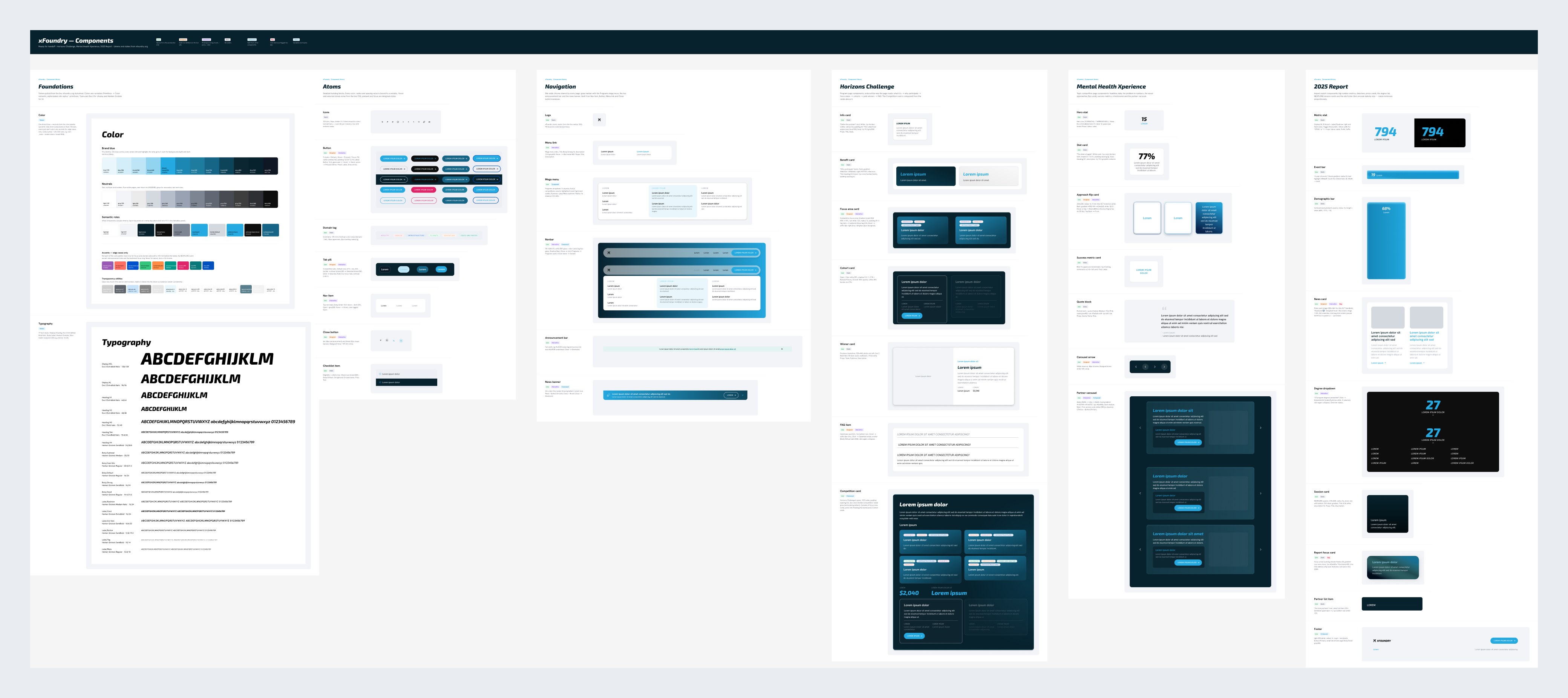
Growing the component library with the site
Problem /
The site already had a small component set in Webflow, built around one bright blue. As new programs and competitions launched, pages needed pieces the set didn’t have, and one colour couldn’t carry every page on its own.
Approach /
I kept the existing components and added new ones as the site grew. I introduced a deep navy as a second key colour, and gradient backgrounds for program page heroes and competition cards, so the look shifted page by page without a redesign. Everything was built in Webflow first; the Figma library here documents it.
Telling a year of xFoundry in one report
Overview /
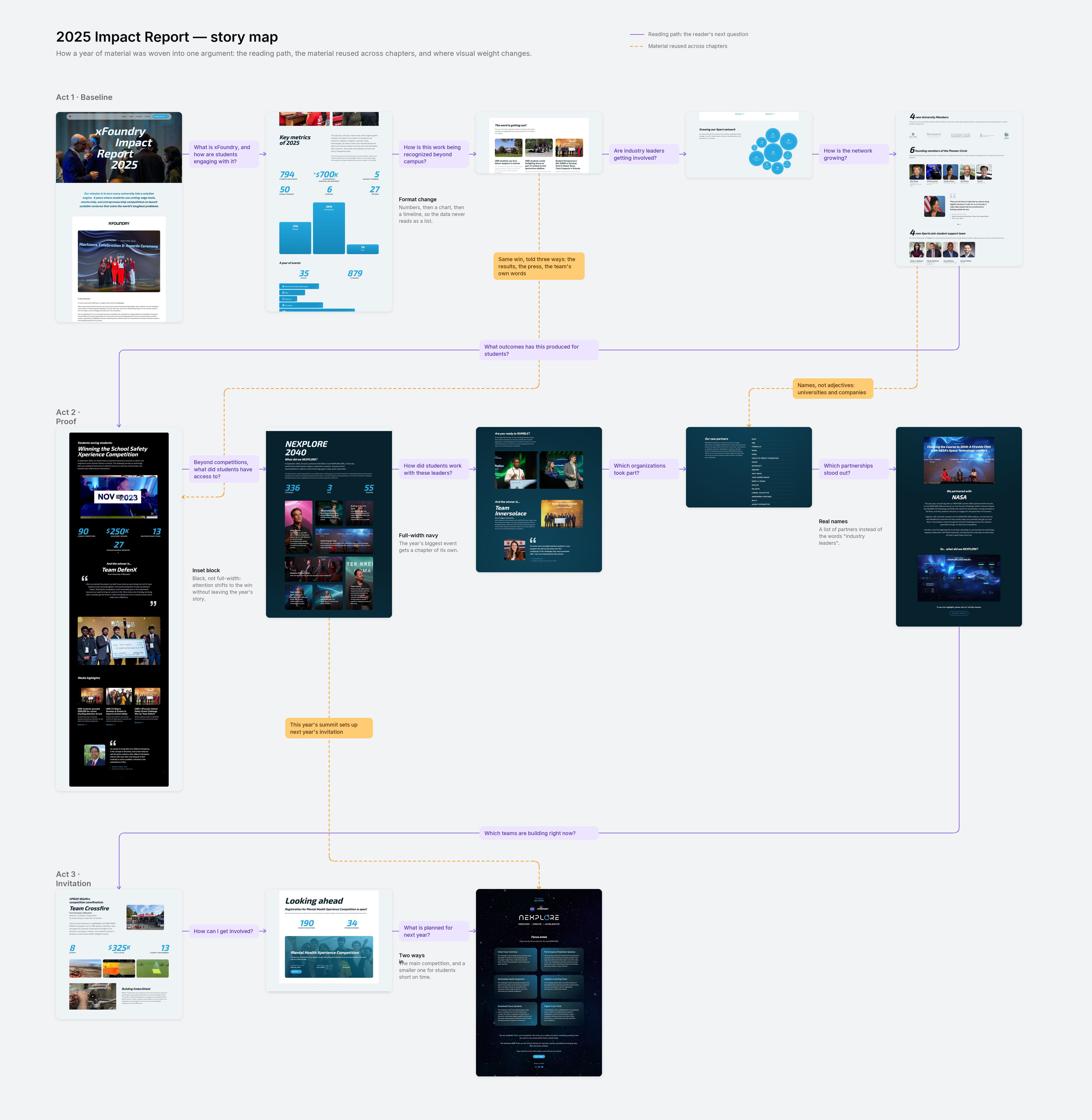
The 2025 Impact Report is xFoundry’s annual update to its partner network, covering a year of growth, student achievements, the NEXPLORE 2040 summit, updates from active teams, and what’s next. It had to bring all of it into one page people would read to the end.
Approach /
I built the report the way a skeptical reader thinks. Each chapter answers the next question an alliance member would ask, from “who is getting involved?” to “has this initiative been recognized?”, until the only one left is how to get involved.
It became the most visited page on the site, and xFoundry shared it with its partners and alliance members as the official record of the year’s work.
AI for speed, people for decisions
Problem /
A small team, many pages. Research piled up, and every new page needed a storyline, a layout and copy, fast.
Approach /
AI did the volume; I made the calls. I brainstormed with it, but it never decided what a page should say.
Research

Organized notes from students, industry leaders and investors, and helped set what to tackle next.
The question hierarchy. I wrote down each student’s questions in order and found the pattern myself.
Design and layout
Set up with xFoundry’s brand, messaging and tone, both drafted options for every new page. I compared the top results from each.
The storyline, shaped so it made sense to students.
Components

Showed every layout for a section, like testimonials, side by side and in the page.
Which layout fit the page and its content.
Images & motion

Fast image cleanup and short animations.
Never changed what a photo showed or its context.
Copy
Drafts and suggestions.
All final content on the website, proofread by me and several team members.